Backgrounds with Style
Many times we want to have some sort of textured background in our apps. Sometimes it’s to provide some interesting piece of information, such as the dead space in a canvas or a transparent layer. Other times it is to merely offer some aesthetics to our program, especially with regards to negative space. Regardless of our reasons, the process for doing so have been pretty much to create a background image, tile that, and possibly apply some type of colorization if our image didn’t already have that rendered in for us. However, with WPF there is another way.
Let’s take a look at two of the backgrounds we’ll be creating before we actually move into the implementation details.
A slight checkered pattern.
A thatch pattern.
Getting Started
We’ll be building the app with Blend as it offers some easy ways to extract resources and we won’t be needing any of the features that Visual Studio provides us for this walkthrough.
So, with Blend started up, go ahead and create a new WPF application, I named mine BackgroundTest.
You should now have Window1.xaml opened by default. The first thing we’ll be doing is creating three rectangle classes within the Grid. You might be wondering why on earth we need three rectangles to create a simple pattern like in the above images. That is a good question. 😉
Here’s a quick summary of the purpose of each rectangle:
- The first rectangle will be used to provide a way to give the pattern that we create a base color.
- The second rectangle that we created will be the rectangle we use to render out the actual pattern.
- The third rectangle will be used to colorize the entire pattern.
We’ll first be creating the checkerboard pattern so let’s select the first rectangle and changes it’s Fill to a really dark gray or black color. This will provide us with a nice starting point starting color for our checkers.
Next we’ll want to select the second rectangle and then switch into the XAML editor. Unfortunately (well, for some), we’re going to have to get our hands dirty a bit here.
In order to create the checker pattern we’re actually going to be using something called a DrawingBrush. If you have no idea what it is, click on the link and you’ll be able to learn all about it, but essentially it provides a way for us to create custom geometry that we would like to have rendered whenever a Brush is used. For example, instead of setting the Fill to a color, we could set it to a DrawingBrush and it would be filled in with whatever the Brush was defined to be. This is great for us because we want to create a simple four-square pattern.
Here’s the XAML that we will be using for the Rectangle.Fill property.
<DrawingBrush Viewport="0,0,20,20" ViewportUnits="Absolute" Stretch="None" TileMode="Tile">

  <DrawingBrush.Drawing>

    <DrawingGroup>

      <GeometryDrawing Brush="{DynamicResource DarkSquareColor}">

        <GeometryDrawing.Geometry>

          <GeometryGroup>

            <RectangleGeometry Rect="0,0,10,10"/>

            <RectangleGeometry Rect="10,10,10,10"/>

          </GeometryGroup>

        </GeometryDrawing.Geometry>

      </GeometryDrawing>

      <GeometryDrawing Brush="{DynamicResource LightSquareColor}">

        <GeometryDrawing.Geometry>

          <GeometryGroup>

            <RectangleGeometry Rect="10,0,10,10"/>

            <RectangleGeometry Rect="0,10,10,10"/>

          </GeometryGroup>

        </GeometryDrawing.Geometry>

      </GeometryDrawing>

    </DrawingGroup>

  </DrawingBrush.Drawing>

<DrawingBrush>
Essentially what the above XAML does is create a view port that is 20×20 and within that viewport draws four difference rectangles. You’ll also notice that I have two Brush resources defined. I defined these in the Windows.Resources section; here is the XAML for them:
<SolidColorBrush x:Key="DarkSquareColor" Color="#18FFFFFF" />

<SolidColorBrush x:Key="LightSquareColor" Color="#34FFFFFF" />
The resources are just a white brush with different Alpha levels. Again, this is so that the checkers can take the color of the first rectangle.
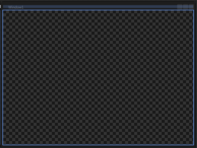
If we switch back over the designer now, we should see something that looks like this:
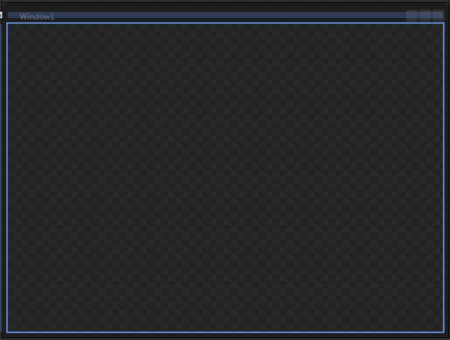
So far so good. Now for the third rectangle. If we change the Fill of the third rectangle to R 38, G 38, B 38, A 83% we’ll end up with something that looks like this:
This third layer gives us that extra level of control for helping determine the strength of the pattern and it’s color. Now in the example that I provided in the beginning you can see that the pattern is much less obvious. This can be tweaked a few different ways:
- We can change the Alpha of the Fill in the third rectangle
- Or we can change the Opacity of the second rectangle
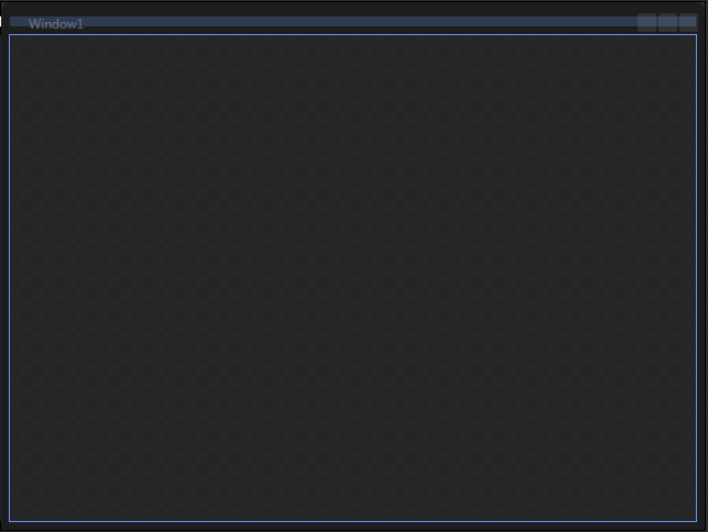
I prefer to do as much tweaking in the the third rectangle as possible. Changing Alpha from 83% to 95% gets us this:
And there we have it, a simple checkered background that we can now use in any of our WPF apps.
The Thatch Look
Ok, I’ll quickly show you what you can do if maybe instead you wanted a thatch look. Well, first off, instead of using the DrawingBrush XAML above for the second rectangle’s Fill, you should use this:
<DrawingBrush Viewport="0,0,4,4" ViewportUnits="Absolute" Stretch="None" TileMode="Tile">

  <DrawingBrush.Drawing>

    <DrawingGroup>

      <GeometryDrawing Brush="{DynamicResource LightSquareColor}">

        <GeometryDrawing.Geometry>

          <GeometryGroup>

            <RectangleGeometry Rect="0,0,1,1"/>

            <RectangleGeometry Rect="2,2,1,1"/>

          </GeometryGroup>

        </GeometryDrawing.Geometry>

      </GeometryDrawing>

      <GeometryDrawing Brush="{DynamicResource DarkSquareColor}">

        <GeometryDrawing.Geometry>

          <GeometryGroup>

            <RectangleGeometry Rect="0,1,1,1"/>

            <RectangleGeometry Rect="2,3,1,1"/>

          </GeometryGroup>

        </GeometryDrawing.Geometry>

      </GeometryDrawing>

    </DrawingGroup>

  </DrawingBrush.Drawing>

</DrawingBrush>
Instead of the four squares in the corner, this draws four 1×1 dots in the 4×4 viewport that is used. Again, I’m not going to really go into the detail of how DrawingBrushes work, check out the MSDN documentation or send me any questions you have about the above code.
Alright, we already have our Brush resources defined so swapping that XAML out you should have something like this in your designer:
Already looking like some pretty cool thatching. 😉 Let’s spice up the coloring though and show the power of the third rectangle.
We’re going to be creating a gradient brush for this one, and I’m going to just give you the XAML for the brush instead of walking you through the three different gradient stops that I used.
<LinearGradientBrush EndPoint="0.5,1" StartPoint="0.5,0">

  <GradientStop Color="#C41F234F" Offset="0"/>

  <GradientStop Color="#C5342C65" Offset="1"/>

  <GradientStop Color="#C5646198" Offset="0.531"/>

</LinearGradientBrush>
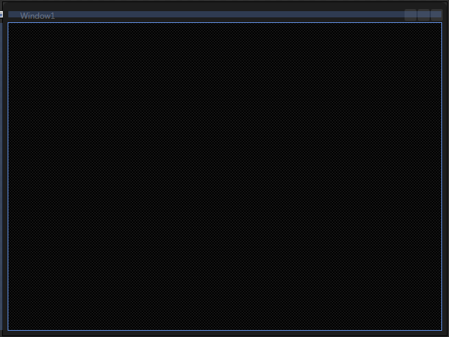
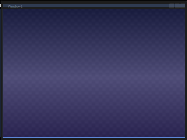
There we have it. If we switch back over to the designer you should see a result that looks shockingly similar to this:
I challenge you to go ahead and play around with changing the Fill brushes with both the checkered and the thatched background and see the difference that each makes. Be sure to change the Fill brushes on both the first and the third rectangles to really understand the impact of the base color (the first rectangle) has on the entire design.
Also, the next steps from here would be to convert this into a UserControl and expose some properties to easily define the three main components:
- The first rectangle’s Fill brush
- The geometry used for the second rectangle’s Fill brush
- The third rectangle’s Fill brush
Until next time!
Here is the sample code: BackgroundSample.zip


That’s a pretty cool way to create an interesting background. I’ll try to keep your thatch background in mind for future WPF projects.
Nice article! Combined it with this tip [ http://pavanpodila.spaces.live.com/blog/cns!9C9E888164859398!339.entry ] for easy reuse.
Nice article, thanks! Referenced in SlidingImageControl:
http://www.codeproject.com/Articles/Tefik-Becirovic#Articles
We turned on the wireless connection on both and checked that they could connect to the internet
and worked at a decent pace. This gadget is one of the best buys around if you are looking for the cheapest
Internet tablets. Being a computer and laptop manufacturer, the company jumped in tablet PC market soon after they
came into market.